Get a full 3D look at your custom skateboard graphic before purchasing at BoardPusher.com. Check the placement, concave, nose & tail[…]
Art Director Q&A Highlights
A couple of weeks ago, David Sheets set aside some time for our Q&A with the BoardPusher Art Director. We have compiled some highlights for you below:
Dave: I’m really not a fan of labels. I think there is a place for just about everything. Skateboarding is an individual thing which is why I think Boardpusher is so awesome. It allows you to decide what “skate art” is to you.
With that being said David gave some insight as to some of his processes when creating skateboard graphics.
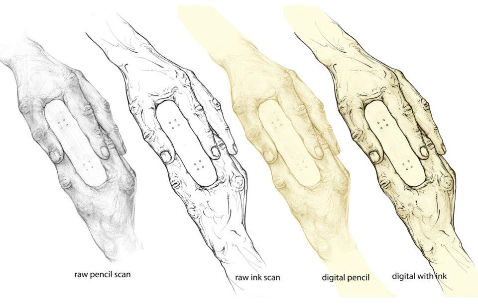
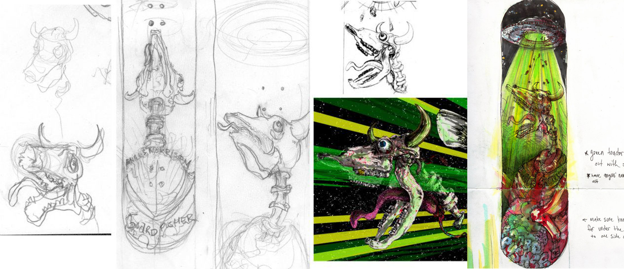
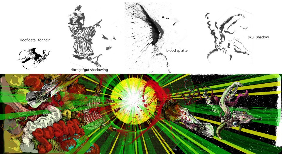
Dave: I always start outside of the computer and do as much by hand as possible. The computer is used last to put all of the drawing layers together and prepare the graphic for digital output. My secret is I trace over my drawings several times making it cleaner each round. I tend to use the digitized sketches to add texture and create color under the final ink drawing.
Dave: I do it both to scale, 9 x 33 inches, and get it scanned at, say, Kinkos. Or I half it so it fits on a smaller scanner. If you half it then set the scan settings to double it or scan at 200%. I also always scan at 600 dpi and then knock down the resolution to 300 dpi before printing.
Dave went on to show some examples of sketches and some techniques he has used.
The final version of the Angus Morrison deck can be found here.
Related Articles
-
-
See how easy it is to create a pro-quality custom skateboard deck with a personalized name and message on a[…]
-
Lou Simeone is a Jersey raised independent artist now operating in the suburbs of Atlanta, GA. We first became aware[…]
-
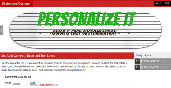
As BoardPusher.com shop owners, many of you have uploaded your graphics as custom backgrounds as a way of offering customers[…]


