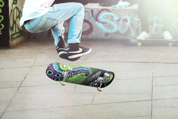
Get a full 3D look at your custom skateboard graphic before purchasing at BoardPusher.com. Check the placement, concave, nose & tail[…]
Skateboard Artist Profile: Lauren Ramer
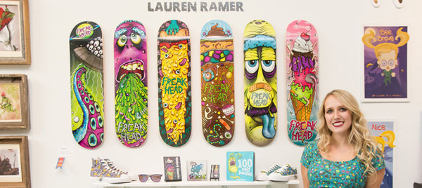
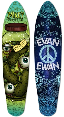
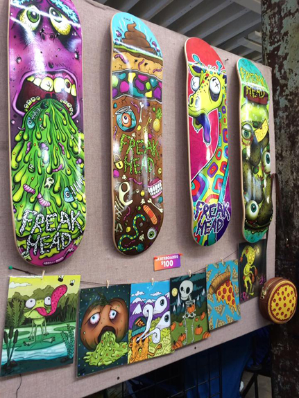
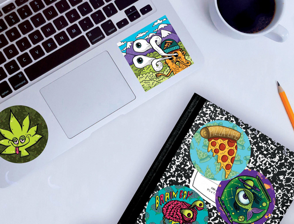
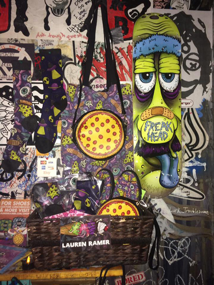
New Jersey designer and illustrator Lauren Ramer’s skateboards give us a warm, nostalgic feeling as her graphics remind us of late 80s and early 90s deck designs. It was a time when skateboard graphics, much like the people who rode them, fit in very few scenes outside of its own culture. Lauren may have a contemporary take on deck design, but her connection to the genesis of modern day skateboard graphics, and her delightfully repulsive designs, made us very curious about her first exposure to skateboarding as well as her creative process.
What was your introduction to skateboarding?
Growing up I had a lot of guy friends. I would hang out with all the skateboarders and so eagerly want to skate, but, unfortunately, lacked any and all talent for skating. Although I sucked at it, I would still try and I would fall… a lot, especially when I turned 18 and got my first longboard. I hit a huge rock, face-planted in front of my house, and was covered in band-aids for a few days. It was around this age I realized that maybe I would be a part of the community by using my artistic side to design skateboard graphics instead.
During those early days in the skateboarding community, were you influenced at all by skateboard graphics? Was it even something you noticed at the time or do you ever think back to those designs?
When it came to skateboarding the graphics were all I ever saw or noticed. When it came to brand, speed, style, etc. I didn’t really know any of it, but the bright and crazy graphics are what always stood out to me.
Your designs have a classic skateboard graphic feel, combining gross or dark subjects with a playful sense of humor. Was using skateboards as a canvas a natural progression for you or something that was always in your sights as a designer?
Designing skateboards felt like a very natural progression for my art style, especially since the subject matter I like to draw doesn’t fit into a lot of industries.
In the beginning, what drew you towards art or was it just something you always did because it came naturally? What were some of your earliest creations and inspirations?
I have been an artist for as long as I can remember, but I personally feel like I didn’t start finding my style and artistic voice until college. Over the years I tried to experiment with different mediums to find what I like, but I really like pencil and ink drawings followed by digital coloring. It just feels natural! Also, one theme that has really stuck with me through my art development is horror. Through high school a lot of my art revolved around horror, creepiness, and just overall weirdness. I’ve always had a love for horror movies and creepy characters so it felt natural I keep that theme in my work.
My designs always seem to take a cute, light turn and I honestly have no idea why. Whenever I begin a project with the initial thought of “Oh yeah! I’m going to make this gross, disgusting illustration.” it always ends up becoming cute and charming somehow. Also I think my use of bright colors also adds to this.
Who is the artist that inspired you the most when exploring this side of your creativity?
I was always very inspired by 90s cartoons like Nickelodeon and Cartoon Network. The weird characters and funky colors always got me so excited. One artist who really inspires me is Chris Piascik. One of my professors at college introduced us to him, and ever since then it made me feel confident that drawing weird and unusual creatures is something people actually want to see!
When creating graphics for a skateboard do you start with the idea that it’s going to look good on a deck or does that realization come after the graphic is completed?
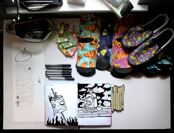
For my skateboards I always take into account the strange long dimensions. I usually start with a small rough sketch of a skateboard shape, then I create my illustrations to fit nicely inside the weird shape. I like to think of things that are tall or long, for instance right now I am working on a really tall and gross cheeseburger deck.
What’s your process for creating a design as a skateboard graphic?
After I have have drawn a little doodle of a design inside a skateboard shape I redraw it at a slightly larger scale on Bristol paper, usually 11 x 14 [inches] or something. This is where I usually take a lot of time to draw in all the details. When I get to the inking phase with pens I don’t like to have to think about anything, so I take my time in pencil mode until I’ve got the drawing to where I like it.
After inking, I scan it into my computer and I color it in Photoshop with my Wacom Cintiq. Adding bright colors is my favorite part. Also, I’m so indecisive about colors. I usually go through like 6 different palette options before I find the one I like.
Describe your work space and the conditions in which you enjoy designing.
Currently I have my own small studio in the second bedroom of my house in which I use to create art. It’s amazing to have my own space considering over the years I never had an art studio. Before this I was living in a small 500 square foot house where my “studio” was just a corner of my kitchen. Now it’s great. I can listen to music or watch It’s Always Sunny… and lock myself in my studio for hours on end. It’s surrounded with all types of art and weird decorations so it definitely makes it feel like home.
Do you figuratively or literally ever go outside of your comfort zone when creating?
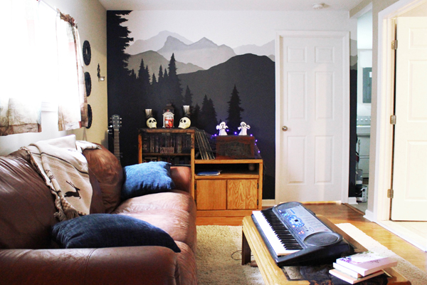
I feel like I haven’t really gone out of my comfort zone in a while, especially with my illustration, but I think that’s because I tend to dabble in quite a few different hobbies and crafts, so I don’t get bored of one thing. For example, I painted a mural in my house a few weeks ago and the style, medium is very different than my illustration. I tend to find other outlets to express creatively so I don’t ever feel a need to leave my comfort zone.
However, I will mention that I am currently doing Inktober this year and, although it’s not totally out of my element, color is my safe space, so doing strictly black and white illustrations is a little scary for me!
What’s the mural you painted in your house?
I feel like most people would expect me to say “Oh I painted a giant monster with boogers” since that is my illustration style, but I actually just painted a really simple mountain scene. I like my house to feel homey and serene. I keep the weirdness to my art studio.
Do you only create digitally or is there another medium you enjoy exploring?
When it comes to my illustration and my style, digital is what I love. However, every now and then I like picking up all sorts of mediums and tools for creating. Sometimes I like sewing and knitting, other times I even like acrylic or oil painting. I think I just prefer digital illustration nowadays since there is no mess and mistakes are easier to fix.
Where does the name Freak Head come from? Why was that choice made for your skate brand name?
When I was trying to think of a name for my boards I wanted something fun and strange. Not sure how those two words came together, but it felt right!
What would be a dream project within the skateboard industry? What about a dream project in general?
For me a dream project isn’t necessarily an individual illustration, but more of a dream to launch my brand into a full on skateboard and apparel company. It’s definitely one of my long term goals, but there’s much work to be done!
What advice do you have for other artists when tackling the concept of putting their designs on skateboards? What general advice do you have for artists getting started?
Just do it! Skateboards are a unique medium in which really anything goes for skateboard graphics. Any gross, pretty, silly, or simple graphic can make an awesome board design. So just start doodling, painting, or whatever it is you do and throw it on a board.
Lauren’s Freak Head skateboards can be seen and purchased at BoardPusher.com/shop/FreakHead, find more of her artwork at LaurenRamer.com, follow her on Instagram and most social channels @laurenramer, and, if you’re fortunate enough to be in Philadelphia this weekend, find her booth at the Philly Punk Rock Flea Market this Saturday, October 27th.
Related Articles
-
-
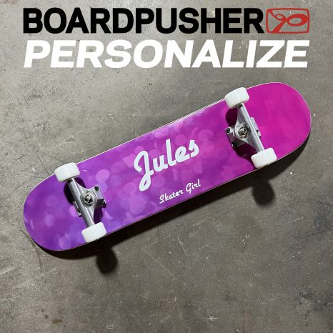
See how easy it is to create a pro-quality custom skateboard deck with a personalized name and message on a[…]
-
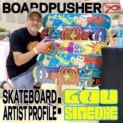
Lou Simeone is a Jersey raised independent artist now operating in the suburbs of Atlanta, GA. We first became aware[…]
-
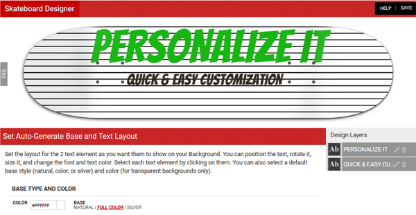
As BoardPusher.com shop owners, many of you have uploaded your graphics as custom backgrounds as a way of offering customers[…]


