Get 50% off a complete fingerboard with your own design when you purchase a custom skateboard deck. Make a mini-me graphic, or create[…]
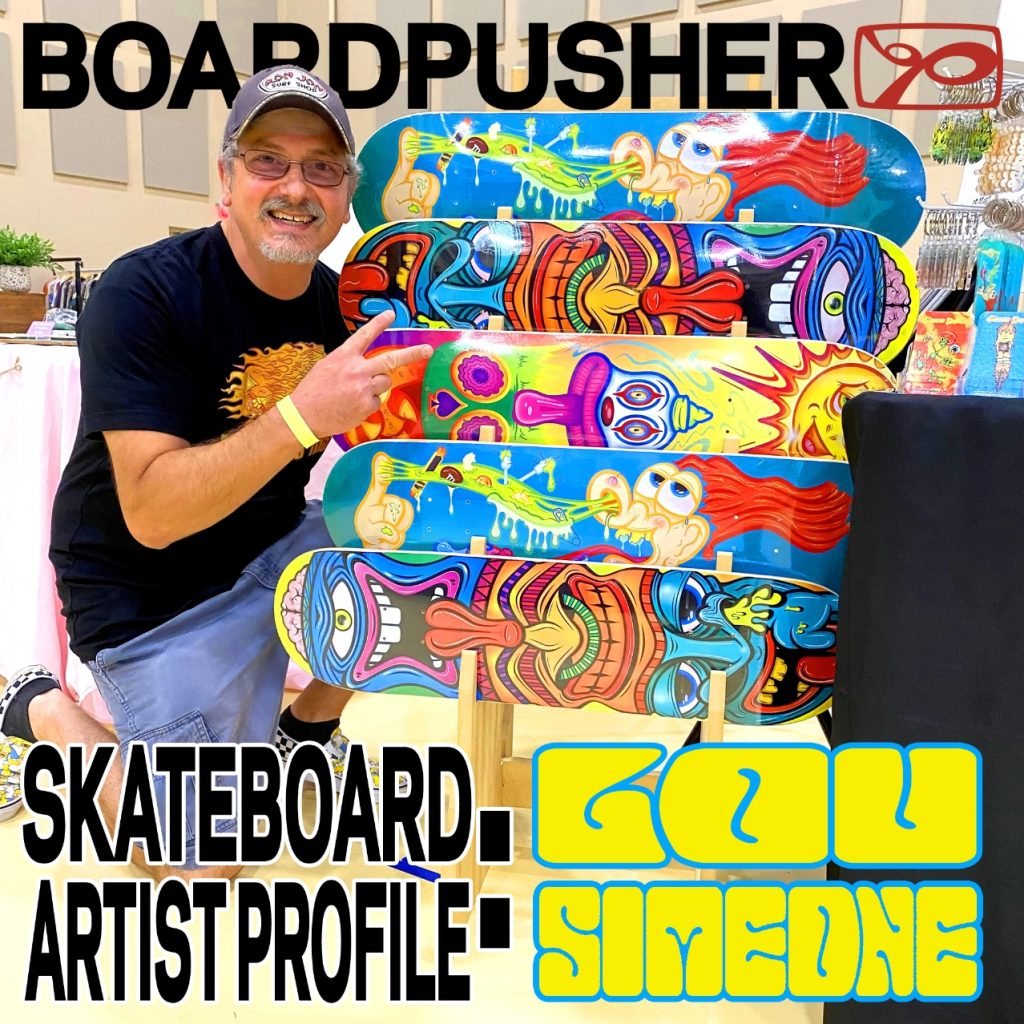
SKATEBOARD ARTIST PROFILE: LOU SIMEONE
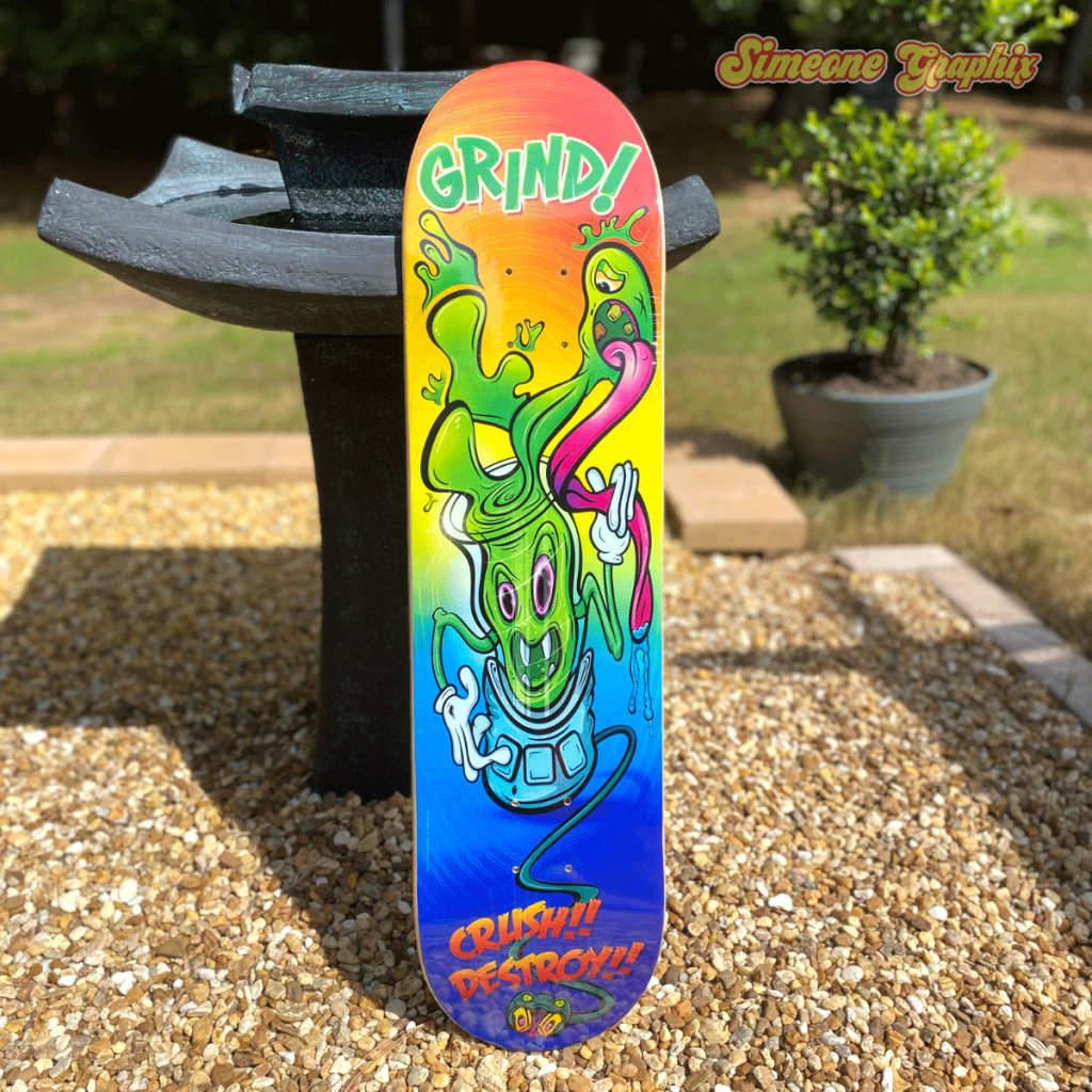
Lou Simeone is a Jersey raised independent artist now operating in the suburbs of Atlanta, GA. We first became aware of Lou about five years ago when his Brainwash graphic rolled through our presses. Ever since, we always take notice when his vibrant and charmingly crass designs come through our warehouse, and you’ve probably seen several of his boards get Featured right here. We decided it was finally time to catch up with Lou and find out about his creative process since his “low brow” graphics fit right in with classic skateboard art and… well… us.
When did you begin your art journey?
When I was a kid, around the age of 9 or 10. I used to sit for hours every day, drawing Disney and Looney Tunes characters. I bought all of Al Jaffee’s books and copied his art too. I even made my own comic strip when I was a kid and sent it to United Feature Syndicate to get it published. I’m still waiting to hear back. I expect it’ll be any day now.
When you found your earliest voice, what were you creating?
As a teenager, my interests shifted a bit, and I set my sights on the album cover artwork of bands like Iron Maiden, Nazareth, and Molly Hatchet. The early Derek Riggs album covers are incredible. I drew Iron Maiden’s mascot, Eddie, countless times. But one of my favorite album covers was Ozzy Osbourne’s The Ultimate Sin, illustrated by the all-time great Boris Vallejo. As time went by, I developed my own style, which can be described as flowing, psychedelic, colorful cartoons usually outlined with bold, undulating lines.
Would you say skateboarding influenced your style, or did skateboarding feel like the next progression for your art since that attitude coincided with your vision?
Skateboards always seemed like the perfect fit for my artwork. I think a lot of my art has a whole counterculture, kind of lowbrow vibe to it. Just look at my art for the stickers I sell too, and I think you’d probably agree. I can cut loose when I make artwork for skateboards. It’s a medium that allows me to be as crazy and free as I want to be. I’m a guy that refuses to grow up and for that I make no apologies. I want to spend my time making the kind of art I drooled over as a kid. Maybe there’s a kid out there drooling over my art. I hope so.
What is your main influence for using bright and vibrant colors?
I’m just naturally drawn to colorful artwork. I like art that screams color and has movement. Maybe it has something to do with so many places that are void of color, like schools and other institutional buildings, which are usually where we spend most of our time. When I was a kid, school walls were cinder blocks painted white or gray. BORING! Why not jazz them up with color? Kids are so full of life and energy. Maybe that’s what color means to me – life and energy – and that’s what I want my art to have.
Where do you typically create your art and what is your workspace like?
I have a drawing area in my studio where I do my sketching and painting. I also have a workstation set up for my digital art. My studio has a chill, relaxed feel to it so I can be as creative as possible. It’s also equipped with a fridge, couch, a TV, and video games for the lazy days when I’m just hanging out. I spend the majority of my time in my studio so I feel like it should reflect my personality and be a place where I have all the things I enjoy and that inspire me.
Along with your style, your art also seems to naturally be right at home, dimension-wise, on a skateboard deck. Have your designs typically felt like they could be a board graphic or was it something you had to adjust to fit your art onto a skateboard?
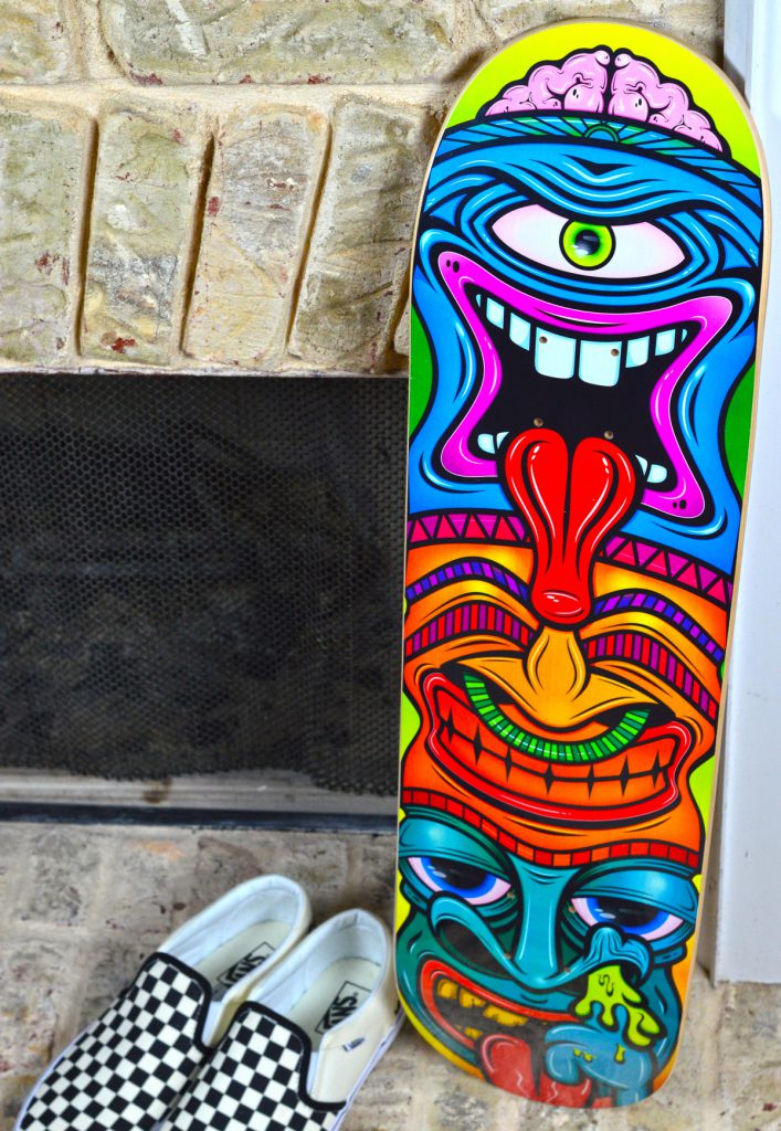
It’s funny because when I first started making art for skateboards my main concern was how I was going to work around the area for the trucks. But my art just naturally flows around it. The length of the boards as opposed to their short width was a bit of an adjustment too. It was challenging at first, but I fell right into it after the first couple of boards.
What is your design technique? Do you know right away that you’re creating a deck design or is it something that morphs into a skateboard graphic?
Even though most of my art might look loose and wild, I’m pretty methodical in my approach. I know straight away that I want to do something specifically for a deck and I’ll marinate on it for a bit before I put pencil to paper. My best ideas come when my mind is clear and relaxed, like when I’m driving in my car or working out. That’s the time when my ideas come flooding in. At that point, it’s a matter of sketching what I see in my head. That journey is a trail of eraser crumbs and crumpled-up paper, but I eventually reach my destination.
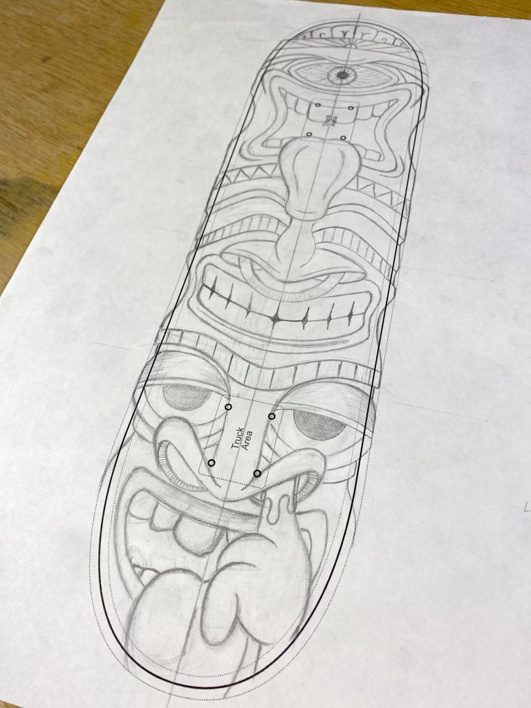
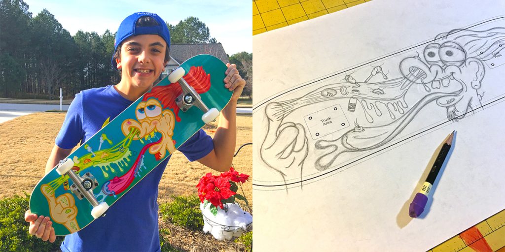
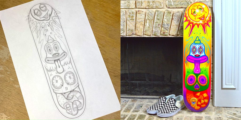
We noticed you printed out a BoardPusher Design template on a regular sized sheet of paper for the sketch for your graphics and then finished it digitally. Can you tell us about that process?
I made myself a vector template indicating where the trucks are, the live area, the trim, and the bleed for a couple of different size boards. I print them out on tabloid-size paper as needed and do my sketching within the template. I work on the sketch until it’s pretty tight. Then it’s scanned in, and the artwork is finalized in Illustrator. That’s where I focus on the line-work and of course the color. The finished deck almost always looks different from the sketch, but I realized a while ago that it takes me twice as long to create my art if I don’t sketch it out first. When I’m satisfied with the digital art, I print it out on my Canon to look at the color output and inspect the piece overall. Adjustments are made where needed based on the printouts. At that point, I walk away and come back to it later. This way I’ll be looking at it with a fresh eye when I come back. If I don’t see anything else that needs to be adjusted, I’ll prep the file for my shop and post up the deck.
What’s your favorite part about creating graphics for a skateboard deck?
I love the entire process, but my favorite part is when I take the sketch to the computer and get into a groove with my headphones on. My taste in music is pretty eclectic, but most of the time I’ll be listening to Joe Satriani when I’m in that groove. At that point, time doesn’t exist and my world at that moment is the board in front of me. I have to say, though, nothing beats holding that finished deck in my hands. Man, when I pull that deck out of the box and see my art on it – that is such an indescribable high.
Do you feel your home base of Atlanta has an influence on the direction of your art?
The awesome thing about living in Georgia is going to all the events and festivals and seeing other artists’ work. I didn’t do much of that when I lived in New Jersey. Of course, living in New Jersey allowed me to hop over to New York whenever I wanted to and visit all its great museums. I miss that. But the Peach State is a beautiful place to live, and I love it down here.
What’s your advice for someone about to create their own skateboard graphic?
Make what you love to make and have fun doing it. Creating art is a solitary activity and if you’re not creating what you love, making something that gives you a rush, chances are you won’t stick with it for very long. You can’t please everyone with your art and creating what you’re into is what keeps you moving forward. Countless hours are spent on a piece, and you naturally want everyone to love it, but, naturally, not everyone will love it, and that’s okay. Don’t waste energy focusing on the people who don’t care for your art. You rarely win them over. There are so many people out there who will love what you create. Stick with it long enough and they’ll find you – you’ll find them, and together you can groove in a world of colorful, psychedelic coolness.
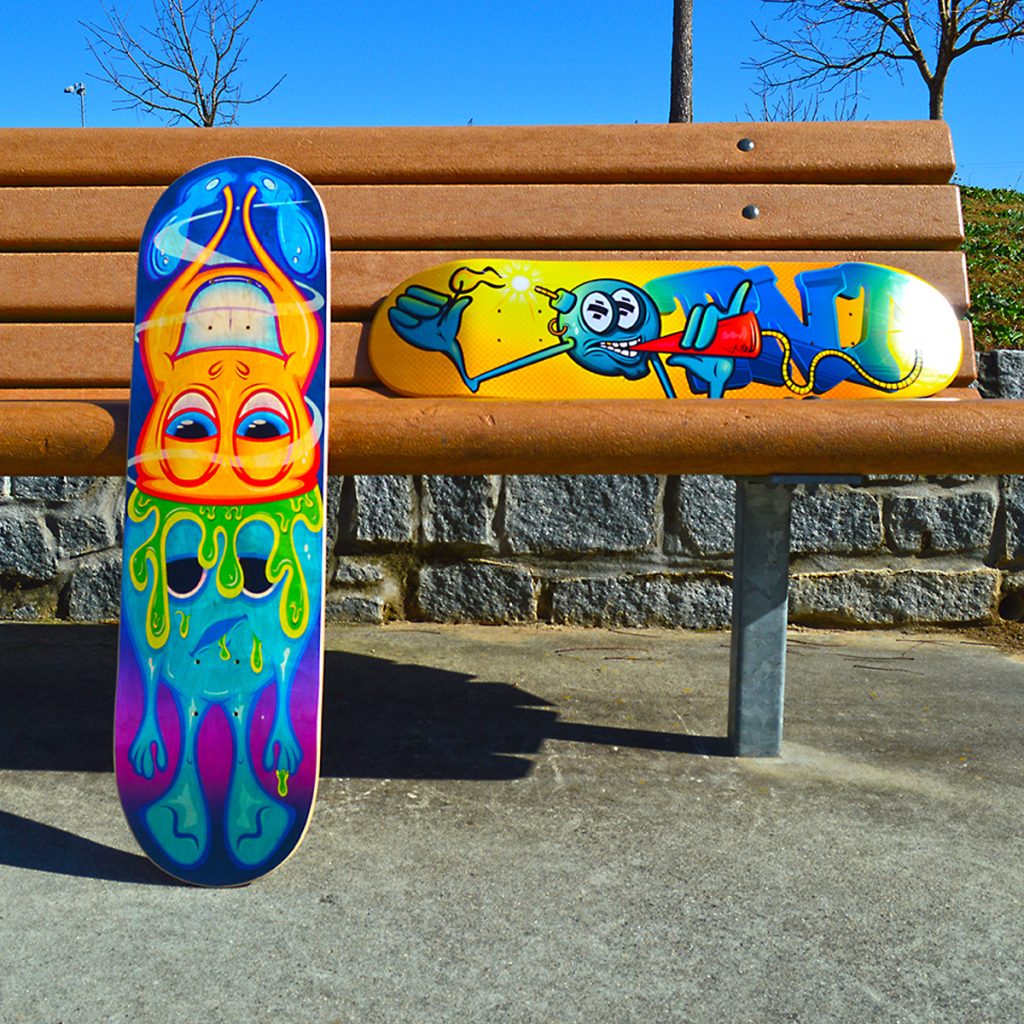
You can keep up with Lou Simone by checking out his website simeonegraphix.com, find him on the socials @simeonegraphix, purchase stuff from his shop www.etsy.com/shop/SimeoneGraphix, and order all of the above skateboard graphics and many others from BoardPusher.com/simeonegraphix.
Otsego Pride Alliance – @otsegopridealliance
The Trevor Project – @trevorproject
Jacey Chase’s art – @jaceychase
Charlie’s art – @punkgarf
Related Articles
-
-
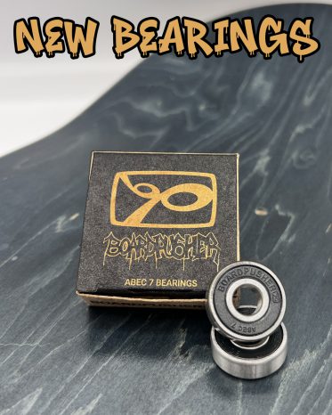
After tireless research & development, we found a bearing we are stoked to put our name on. Equipped with the[…]
-
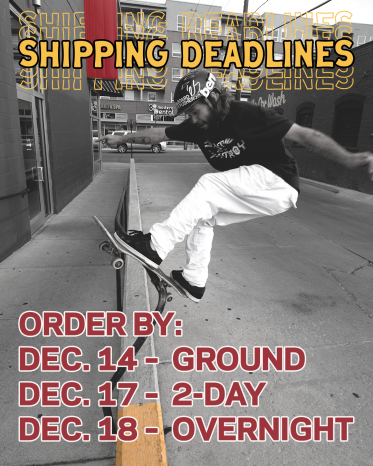
You still have some time to get your BoardPusher Custom Skateboard order in time for Christmas, but don’t take too long. Place[…]
-
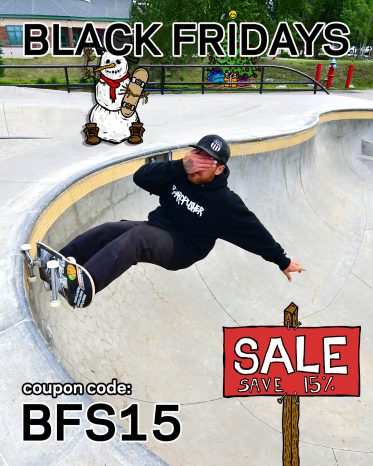
Take 15% off your entire BoardPusher.com order every Friday, and all weekend long this November, w/ BoardPusher Skateboards BLACK FRIDAYS! Custom skateboards, longboards, griptape, specialty bases, completes, just remember to use[…]


